Cognitive Load Simplified - Visual Product - Natural Law Scanning Eye

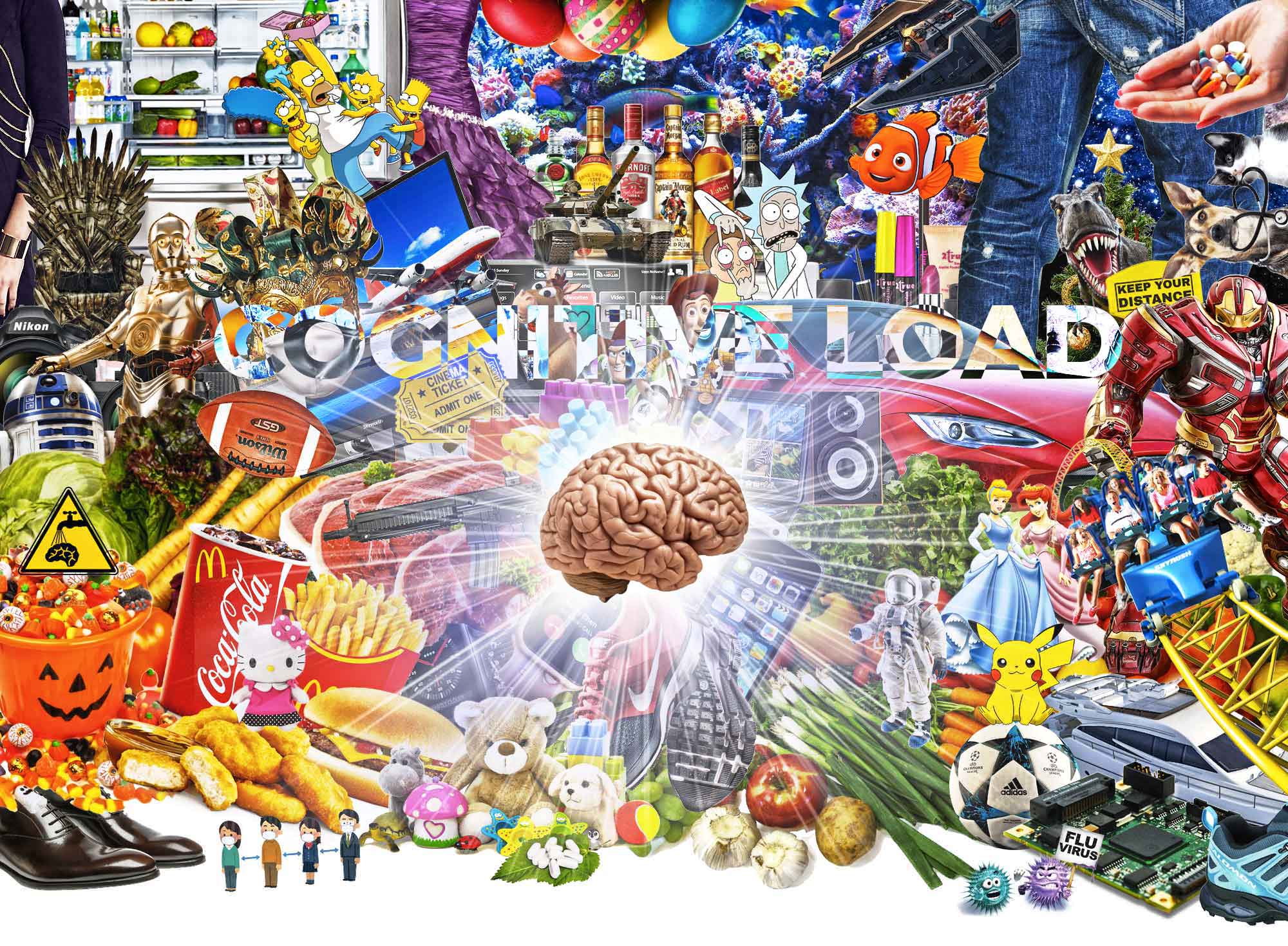
Cognitive Load

What is a Cognitive Load and what it means?

Our profession as designers and visual artists requires us to understand the basic laws of human perception.

In design as in almost all professions in the world there are endless ideas around the best practices on virtually everything. Ideas are always based on experiences extracted from the particular case/s and they create endless opinions but in this article we will focus on something quite different than ideas and opinions.

What is a Cognitive Load and what it means?

Ideas are based on past experience but is there something more solid which does not change?

It is natural human perception.

Yes I’m talking about the nature which gave us this physical body with all it’s limitations. It also gave us a certain perception which is as it is and we can’t do much about it.

The only thing we can do regarding the perception is to understand it and make use of it. We see colours that our eyes are made to perceive with our brain (with some variations with color blindness etc).

Also on the other hand our human brain can process up to an x amount of information in a “row” in a particular time span and so on.

Why do I mention this? This is something most people understand as it is the reality of human condition which we can confirm every day while living in this body we have and in interaction with, others and with world/life in general.

It is extremely important to understand the limits of perception if we want to create successful products, interpret analysed data correctly and communicate messages which can be received by others with understanding.

How the perception is shaped, how much we can assimilate, how much is too much in one view and so on?

So let’s see a little example which sums up this so called “cognitive load” as simple as possible so you can test with yourself and others.

Ok so now try to imagine a situation in which you are hungry and in a rush to catch a plain and you would like to quick snack one fruit before flight (maybe you don’t eat fruit or fly for some reason but try to imagine as the choice apply to any other situation).

Than you are offered to chose from:

Scenario A
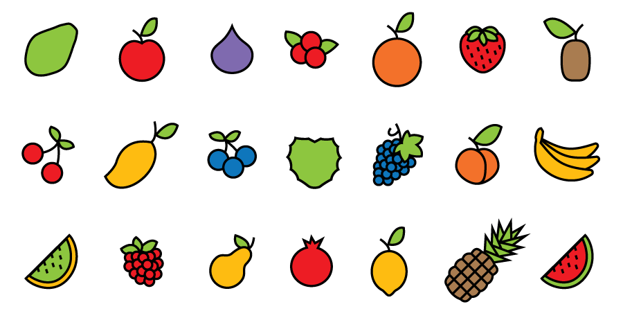
Scenario A - Fruit example
Papaya, apple, fig, orange, cranberries, orange, strawberry, kiwi, cherry, mango, blueberry, cherimoya, grapes, peach, bananas, honey melon, raspberry, pear, pomegranate, lemon, pineapple, water melon.

Scenario B

Scenario B - Fruit example
Apple, bananas, grapes, orange, strawberry.

How do you feel about it?

What menu is easier to chose from?

Scenario A or B?

Obviously in Scenario A your perception is overloaded and your decision making is much harder/slower due to a big variety of choices with not much time to process (in addition to that all is given the same importance as it is sorted to show as equal so there is no difference).

In this case you would pickup anything that comes first in the list that you can recall having a good past experience with or you would get frustrated and leave that desire and run to not miss the flight.

In the Scenario B there is less variety but the choice is almost instant.

(You can chose even by the unconscious method of segmented elimination, where in the mind you eliminate what you “don’t want” vs “what remains” which is not the case with Scenario A. In case A eliminating something from the long list there is no mental space for mind to hold on to eliminated images and all the potential choices, until the actual decision is made or paragon with.)

NOW RESET

Close your eyes for few seconds, off focus. After that continue to read if you are still here :)

Still here? Not got tired already?

Ok, now imagine another situation in which you are trying to find your friend in the big crowd of people in the sport stadium or a metro station during heat hours.

Same problem.

After focusing to find your friend, looking at almost every person in the crowed, very soon focus is exhausted and you would not be surprised even if your friend is standing now in front of your nose as your mind reached the cognitive load and gets totally off focus while still awake.

Why do we get so easily tired and loaded?

Because the anomaly of the thing is that everything we see we in each moment we have attached meaning to it from past experience even that we do not realise most of the time and that wears us off pretty quickly by just looking at something with attention.

This gets even harder when we are trying to learn something new and create new experiences.


We can imagine now that all those fruit in Scenario A and B or friend you were finding in a crowd are movies or books or apartments or any other product it will work exactly the same because the perception pattern works the same inside our brain.

You could wonder now maybe where your “Super Crowded” Scenario A could work in a product?

This would work in the case where a user have not seen any content during that day and ended directly into your case with a long variety list and has all the mental load and good will to absorb the content but in todays world it is less likely to happened as we are bombarded with concepts all the time and almost everywhere we lay our eyes on we get distracted and stimulated (with colours, sounds, words, stories, concepts etc).

Similar cases like Scenario A could work only on user discovery, where the user is deciding by themselves to intentionally drill into details but not likely when this case is thrown directly in their face, unexpected without the explicit request or need for it.

So the overall human perception is something we need to master before even getting the idea for any new visual structure we intend to create.

As the cognitive load is one of the unspoken laws which govern our brains in each moment so does the other unspoken laws related to the interactivity, color and movement which all comes embedded into our default setting as a human being. (I’m not going to expand now on those as this article could easily become a book in that case)

And lastly we as visual experts should also know to communicate to our “stake/fruit” holders explaining why a certain structure of information, where “less is more”, could potentially be better than more “rich/crowded/optional variety” structure of content in a certain project we are working on without even testing something that the basic law of perception goes against.

So in other words when it comes to creating a new product, or feature the first checkup should be the one done from the law of perception level and if that pass the test, than all the rest of best practises, data, numbers and further testing can continue.

If the concept and structure of a project does not pass the basic logic of perception there is virtually no use of continuing with such a direction as it is doomed to fail from the start.

Article written by mihailo
Mihailo-Net Logo

Mihailo Designer

UX/UI CV