Evil UX - Practices of Dark patterns in User Experience

Dark UX patterns

Why I as a UX/UI Designer would never enjoy working for these 3 giants?

What is Evil UX & why it will fail?

Who will take over & why?

In this article I will walk you through some of the “new” (not so new) practices in the User Experience design that biggest companies in the world are using to boost profits and trick users.

I will also mention why I, as a designer, will never work for Google, Amazon and Facebook, will show you examples of dark patterns of UX which they use in their products and show you why in this case I decided to call these design tactics simply Evil UX as these practices go over the “darkness” and against any design principle and common sense.

This is gonna be a long article, detailed in some parts, so buckle up folks and enjoy the ride! ;)

After reading this you will get the overall understanding of how these tactics can be applied for your own product in case you would like to try these patterns and profit out of that but as you will also see, that in the end, all of these Evil UX tactics will fail as they are not sustainable and it will be very clear why they are not the future.

In Evil UX I will take examples from 3 giant companies which created a monopoly and dominate the market today, in 2020, while they are still considered to have the “best products” for their customers, so by exploring their products one can learn a lot and this is what I will share with you in this article.

Disclaimer:

I have no interest or financial benefit of promoting any particular product mentioned in this article, though I use some of these products as a user myself. This article's purpose is to express my professional concern as User Experience designer in some practices I have noticed and would like to share it with you in order to inspire you to create future products.

Intro

“A work of a Good Designer is only to provide a User friendly Design to the Users!?”

That statement is not true and is one of the biggest misconceptions in the industry about what User Experience design actually means and what the UX profession is all about.

The UX design does not equal to “Ignore the Business Value” which majority assume so please remove that assumption in case you are thinking that as a designer I’m going to brag about “making things best just for the user” as there are many different ways of meeting the business needs without being shady and many companies do know, respect and apply different approach with achieving high profit as well.

On the other hand for some of these giants the easiest thing is to profit out of someone who is “not all there” like selling “invisible” user data, but as you will see that is not the future as that is how these and similar companies got on the top in the first place in a fashion style of doing things in shadow like “Accept our Terms & Conditions so that you can skip the paperwork and get to the the dreamland where houses are made of chocolate”, that sort of a thing.

It's funny that you can't never tell from the picture if it is real chocolate or something totally different... ;)

Real chocolate or something else?

Let's Start.

EXAMPLE 1

G

Search on the GOOGLE

We all know GOOGLE.

Who dares to say that anything this media/tech giant is doing in design and in business can possibly be wrong? (Check article “The Holy Material UI“)

GOOGLE for many years now dominates the world in a way “no one could ever imagine possible” (keep this phrase in mind as it will come handy later to conclude the article) 

So as the company grew and got connected with more and more technology and people more and more sophisticated tactics of the User Experience were created.

First small point to warm you up is that, for example, this article could also be totally excluded from their search engine as you can see that the keywords (words) used here are probably not gonna be the best marketing material for them to use so “simple exclude from search results” is pretty much expected for this article, which already creates a not so nice User Experience for someone who wants to find a non-bias information. (I’m not gonna expand on this part, or on the useful/“good” things GOOGLE did design or business wise as this article will only tackle the dark UX part as you can see in the title and I leave the other topics to the rest of the world to deal with :)

Ok so, let us remind of how GOOGLE came to be used, the purpose and what the look & feel of their product was all about. (Search the Internet)

It started as very friendly, benign product available to all with no limitations/borders, non limited to market, user personality, free of all bias.

The name itself was related to googol which a 9 year old child coined in 1920. (More about it in the book “Mathematics and the Imagination“ from which came inspiration for the name GOOGLE)

Company’s official motto in last few years is, for some reason, Don’t be Evil which at times sounds a bit ironical coming out from a company which uses pretty sneaky tactics to handle their users and their product for the most part.

So from FRIENDLY, NON BIAS, OPEN/FREE product it became: 

NON-FRIENDLY (Selling products which existence is solely based on constant feed of personal information and behaviour of their users/targeting, sneaky UX & UI design which hides options/functionality and scatters them in parts around the product for user to figure out by themselves, non transparent without leaving availability of the tools/features in clear focus, leaving not much options to remove personalisation and tracking etc)

TOTALLY BIAS (Showing you bias search results even for users which excluded themselves from personalised content) 

NON-OPEN/CLOSED (Showing you only results which are targeted to your area/part of the world, excluding keywords which does not suit the marketing of the company and their pears)

As funny as it may seem that the term itself ”google” in the dictionary today means to ”search the internet” tells you a bit of how dominant this product is in the collective conciseness, so it comes very ridiculous and ironical that today in 2020 you will find more non-bias information if you simply search with tiny DUCKDUCKGO search engine instead of GOOGLE.

In this example you can see what I’m talking about.

I tried to search for a movie I saw long time ago, but could not remember the exact name so I googled :) with these key words: 
"french movie about assassin and kid thief"

Here is the video recording to paragon between 2 searches, one done with GOOGLE vs one performed with DUCKDUCKGO. (the movie is called "Assassin(s)") 

So as you can see in the case of GOOGLE user needs to click extra step in the user journey and can't see the full thumbnail of the movie, which can be found but much further down the results list because the other movies are pushed on top results.

In the case of DUCKDUCKGO the result is directly available within the first view and you also can see the full thumbnail with the movie title.

User Experience - DUCKDUCKGO vs GOOGLE searching a movie example
As you may see in GOOGLE example the user has 2 steps and much longer time to search to arrive at the requested content and also in GOOGLE's Step 1 on the bottom of the page where user is discouraged to continue to search more by using the words: ”The rest of the results might not be what you’re looking for. See more anyway". The DUCKDUCKGO on the other hand has the movie directly in the results in the first step. (the thumbnail is also better than the one used in google search as it shows the thumbnail with the movie title in the image which is not case with googles search as they show the thumbnail without the title so it is looking much more generic and it is harder to detect.)

It is funny to me, to see the purpose of this product today, as from their behaviour in UX & business wise it looks like this company assumes that the users will continue to use their services in any case with ignoring that their users joined and start using their product, not because “it is cool” to use it, but because it is/was useful (it was serving their needs for searching the internet and finding relevant content).

Once that users figure out that the product is no longer serving their basic needs “I search what I want and not what you want to show me” they will go to alternatives and we are seeing that trend happening today for a good reason.

This type of sneaky UX & UI tactics you can also see while setting up your Google phone, PIXEL 4. Inside the settings on each of the categories almost all the options are set by default to be active, then, when you want to customise or switch off some of these “great features & options” good luck on your journey as you will need it.

Dino

*Reminder

Do you remember back in the “dinosaur age” for example in 2008 :D how the first algorithms and personalised content and the usage of users data was used? 

Users would navigate and search on GOOGLE without knowing about the existence of personalisation machine underneath, which was tracking their moves and creating hidden history, so that some people might thought that it was a “spontaneous miracle” if the next day they will see similar ads/product somewhere on the other side of the web, on some other, seemingly non-related site (as google ads were following the behaviour).

For some people the awareness level of the trackers and how they work is still lower than what it will be in the future, but today in 2020 we have much more awareness and laws around this than what we could have ever imagined from the beginning
.

The future of the INTERNET is privacy (that you can see in Android 11 and in the new Apple iOS where new regulations require the apps to show the explicit consent to allow tracking and could be set each time the app is being used. So as you see from 0 transparency now we are getting closer to where we were suppose to be from the beginning in essence before the dirty tricks, where the user is taking care of and where focus is more, and more, on their needs which is freedom and less control as cliche as it may seam to some that is the future.)

One of the reasons for change is also exposure of these tactics and a global cognitive overload in todays products, as the ads are everywhere around us so there is no place we can look without being bombarded with content and marketing messages, so the unconscious mind in order to protect itself shots down and put an invisible “ignore” which some call “Banner Blindness”.

Users want to use the product and not the other way around.

The future of the UX is in the most relevant User Experience and who is gonna be able to provide it that will be the one that will hold the future.

And how can we profit then?

If you ask this question I suggest you to get off your ass and create a better strategy which will make the current one obsolete, because if this is the only way your product could profit, than the question is does the world really need your product or this product is slowing down the progress?

Mr Lincoln

Mr Lincoln

“You can fool some of the people all of the time, and all of the people some of the time, but you can not fool all of the people all of the time.”

Pretty funny but true and something to keep in mind when building products of the future.

EXAMPLE 2

A

Closing Account on Amazon

This example of another Evil UX pattern I came across while I had the need to watch a movie which, of-course, for the most part, a non-commercial, higher quality movies you can’t find on the Netflix, so I came across it on Amazon Prime. (For those interested in the movie I was trying to find - “Dogville”)

I was searching for some time on Google, and for some reason, the Amazon Prime, was the only option available on the internet for that movie. (maybe you can guess the reason from Example 1)

The frustration came as I didn’t have the account, but opening one on Amazon was pretty easy like on any other old website from late 90ties. I filled my personal details and I was a member now, great!

I virtually run to get the movie but the first problem appeared while I tried to pay with my credit card. 

Amazon cashier simply did not accept the address field and it kept showing the error by saying that the address of the credit card was incorrect. 

I tried my second credit card but same error…

So at this point I found myself being in a role, on the other side of product, being a super frustrated user, a consumer who googled the internet for an hour now just to arrive at the dead end. My mind turned spaghetti as I reached the cognitive load while finding this movie to watch, willing to register and pay for it but for some reason it was not possible

At that point I just gave up.

After that exhausting experience, pissed out I decided to close my account.

I said to myself: “This is so stupid, I can’t even pay to watch this… let’s just close the account.. I knew I shouldn’t have registered in the first place.”

But only now the fun starts! :))))) :(

I could not find the CLOSE ACCOUNT / DELETE ACCOUNT button, link, option... or whatever you call it, there was no clear possibility for the users to close the account on Amazon!

Something was very wrong.

I thought: “Is it possible that the Amazon internal teams are just boosting their own ego on numbers of how many people signed up this week??…” and “…why do they want users which do not use their product to be on the site…??” I could not get my mind around this at first.

After another hour spent on finding the option to delete the account on Amazon, seeing their poor UI and UX flows inside different parts of the product, I had to go elsewhere to check the internet for a tutorial. (I found one on NordVPN ironically enough a VPN service site)

So here it is! How the UX flow works and how it has been intentionally designed for Amazon users who wish to close their account:

UX flow for Closing Your Account on Amazon

1

Go to Amazon.com and login to your account, then scroll to the Help section at the bottom of the page.

Step 1

2

Scroll down to Browse Help Topics and click on Need More Help?, then tap on Contact Us.

Step 2

3

Click on Prime or Something else.

Step 3

4

Scroll down to Tell us more section and choose Login and security and Close my account.

Step 4

5

You will then be given an option to contact the Amazon team by e-mail, phone or chat.

Step 5

6

After all the steps are done, now you as a user, will have the possibility to close your account on Amazon, you will just need to wait for Customer Support to respond to your Email (or to Phone call/Chat if available) on which you will need to reply for "final confirmation".

Check the full tutorial here.

So after I followed the steps from the tutorial, on the third day I was contacted via email by their Customer Support where they stated that I will lose the access to all their services (approximately more than 20 of them which I have never even heard of).

They "wanted to make sure I was clear" on what I was doing and they asked if I’m sure that I want to delete my account. (At this point what do you think? Was I sure and dedicated to close my account? I leave that answer to you dear readers hahahah)

Then I realised that the whole purpose of having users being registered with no direct spendings on their part as consumers is to profit out of personal data connected to their account in services which they promote to third parties.

How fun is that?
It’s a lot of fun as you can see.

How the story goes business wise from there on I’m not very interested in, as for me now I have already seen the darkest, most "Evil UX" pattern I have ever experienced as I was seeing this not only as a user, but mostly as the UX/UI designer.

Having no clear option to delete your account on one of the most popular services in the world?!

Come on :D give us a brake & land down to Earth please.

Mr Lord Acton

Lord Acton

“All power tends to corrupt and absolute power corrupts absolutely.”

When you have a strong customer base does that allow you to do edge stuff just because you feel so big & strong? 

Should it be the other way around?

EXAMPLE 3

F

Irrelevant Notifications + Un/Follow Facebook Friends feature

In this one I will show you how a supposedly “friendly” platform, which started as a product which connects people deviated and continue to deviate in desperate tries to create more and more engagement.

This UX pattern goes against itself by using the method known as “HOOK” (Check book “Hooked: How to Build Habit-Form Products“ by Nir Eyal)

In this case I’m talking about UI notifications element that Facebook is using to show now also marketing material IN THE SAME WAY it used to notify the users before only about the pages they follow and friends and their own activity which is the only relevant thing for the user.

By doing this new redesign in 2020, Facebook showed the clear direction and went against the essence of ”Hook” itself in assuming that habit which was formed due to relevant reward (own friends, own liked pages and users own activity feed) will work the same if the marketing material is pushed in the same notifications with equal priority/importance.

Facebook notifications

Also notice how now in similar fashion like google (setting all which they can be allowed to be set by regulations to ON by default) the Facebook uses same for their features.

But here in the next UI change Facebook UI fails for the user but it is success for them. Look at this next example to see where user needs to go to unfollow friends.

When you get a new friend on Facebook by default you become a “follower” of that person. 

The UI element which shows that you are friends is a button, which implies that once you click on it that it will take the potential action of removing that person (unfriend) instead of acting like a dropdown and give you more options which is the functionality of that button in this new UI update. 

So as you can see this is another sneaky little dark pattern which goes against the basic logic and principles of the design.

Facebook Unfollow/Follow friends

For this case it has been made so that psychologically user doesn’t know what dropdown is in the presented UI and that everything looks like a button, from which once you clicked on, there is no way back. (So the UI elements are intentionally not set with clarity in mind)

The reason behind this dark practise, previously mentioned, is that the Facebook needs their users to follow people so that more linking is done on the backside of things and more potential notifications the overall flexibility of the algorithm for managing the user will be available to the product. 

The idea is that the targeting can be even more sophisticated on what you as the user will see in your future feeds and potential notifications, etc, but not necessarily what user actually needs or wants.

With this UI and UX change, in 2020, Facebook signed off from reality, gone to wonderland where they got lost in numbers and gave their big seat on Earth, up, to some future product, which will take over and deliver basic features with better practices.

(Something that happened to MySpace only that Facebook practices and kingdom was bigger, lasted longer and revealed a lot of bad practices in business (check "The Social Dilemma" or "How to Solve Social Dilemma"which the next product will not be able to adopt due to this exposure, as “once when you know the trick, you can’t get tricked anymore”. That would be and is the strength of the new product which will take over to connect people and a big learning curve in determining future best business practices and User Experience in general. This change is happening already today with different platforms which are emerging now and which have a very different mission to start with due to the issues these bad practices created in the world, the new product will use it as a solid advantage.)

So again as you can see the product is using you instead of you using the product, but nothing to blame them about as you, the user, signed their Terms & Conditions, no matter how abstract those terms were, you agreed on them. (If you want to laugh your ass off on this topic checkout South Park episodes: ”You have 0 Friends” and “HumancentiPad“ so you will get the idea if you haven’t already got it.)

The point is that there can be much better ways of doing same things, if the idea is to profit out of users interconnectivity (engagement).

These current and past trends are not the only one profitable way of doing UX and boosting monetary value.

Please don’t be Lazy Folks and get creative :)

Conclusion

All these giant companies mentioned above, by their current numbers, data, market domination and usage allow themselves to assume and act as if that the users will always use their services no matter what, which allows them to have an arrogant attitude toward user focused design and ignore theirs users basic needs to whom they are suppose to build a product for.

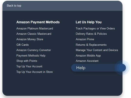
If I, as a user, need to setup my privacy settings and spend an hour or two just for that, on my new Google Pixel phone, in Android 11 and have only functionality, which forces user to use a specific tool otherwise it does not work (like Google Assistant for example) than you still failed to provide a user friendly design and you have a long way to go and the first step in that direction would be to change the mindset.

The whole idea of being an UX designer always was and is to provide best user experience, cover user needs, bridge them to the company needs and it is a difficult and a honourable work but today for many products one as a designer can’t feel too proud about what they are doing in case they happened to coexists in the environments which support & embrace, most of the time, these dark practices.

But things are changing and the change is the only thing that is forever. The only constant there is.

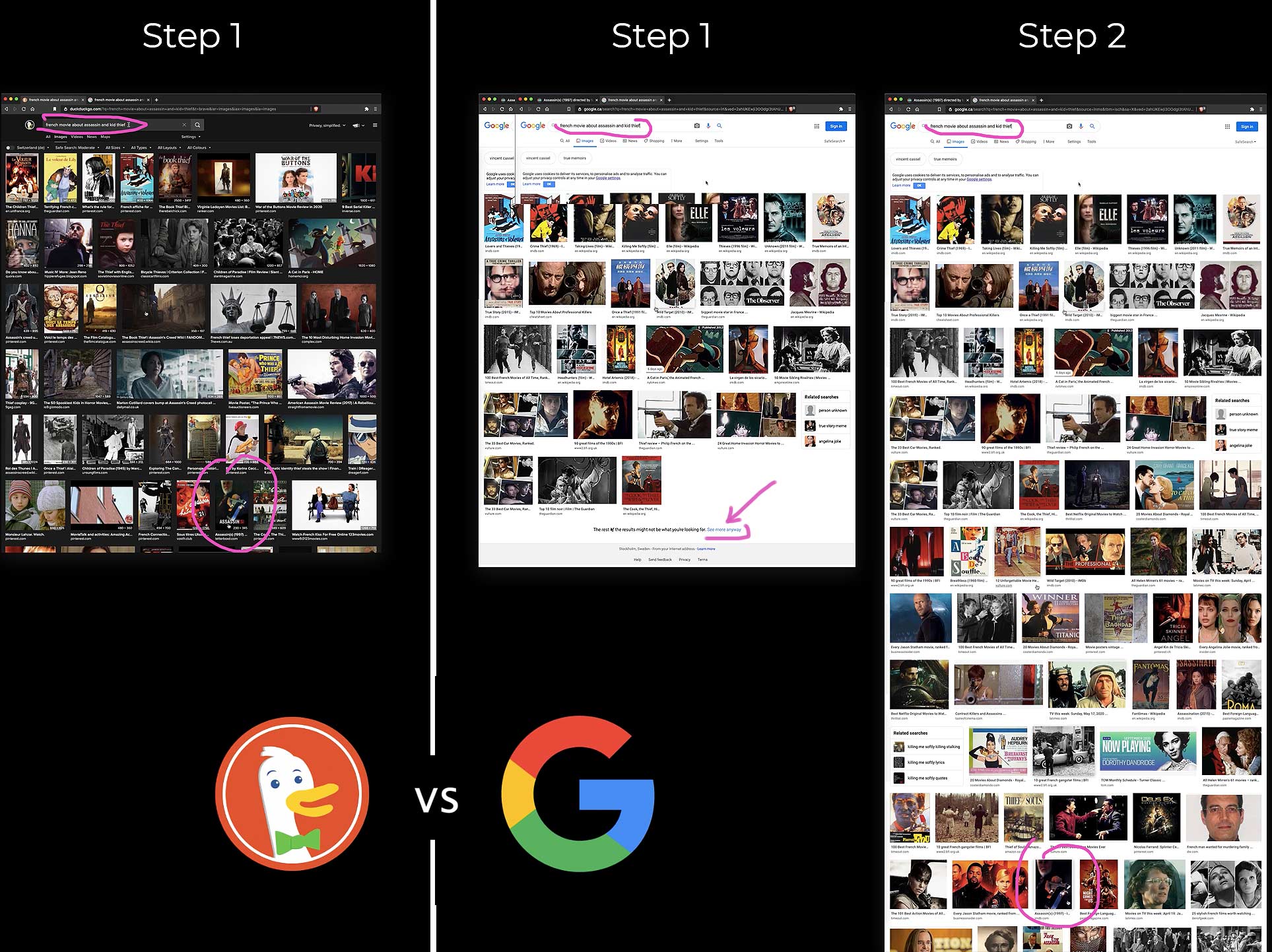
These “sweet” companies allow themselves to completely ignore the users even when it comes to helping out users in Customer Support.

That part they leave to others to handle as they are “too big to cover how big they are” :D so when it comes to understanding their product latest system updates, new tools and features, they leave that to users to figure out for themselves, to troubleshoot and make reviews (which ironically also boosts their visibility and their non friendly complex product even more).

It is very illuminating and inspiring to see the future possibilities in design despite the current failure of User Friendly Design and the trendy “Evil UX” dark cloud above our green valley.

Rain will fall and the sun will shine again.
Good to have that reminder from time to time.

The same way as all the empires failed in the end (and you see that there is and was always an end), all the products and strategies get outdated and updated to something new never seen before as only the most adaptive to change survive and evolve.

So it is no coincidence, that even though the other civilisations in human history had so sophisticated means of handling things, selling, build products and dominate the global consciousness and narrative, perception, market needs etc, it seams that the human nature, which is a part of something higher than simple narrow product games we love to play with, will always go beyond any barrier it set for itself.

As each moment is a new reality, a new step into unknown direction from which the previous step never existed as each next one opens a non imaginable future horizons with endless possibilities for expansion and creativity.

No matter how hard you try to imagine the future it will never be anything close to what you have in your mind(set), because our human mind can operate only within current outlook on the world, with current tendencies and that in itself is limited to start with.

So in other words, never limit yourself to current settings.

Allow yourself to expand beyond, as no one made progress and innovation by embracing normalcy, standards, or by being static... as known "best practices" we create today, we break them tomorrow.

Article written by mihailo
Mihailo-Net Logo

Mihailo Designer

UX/UI CV